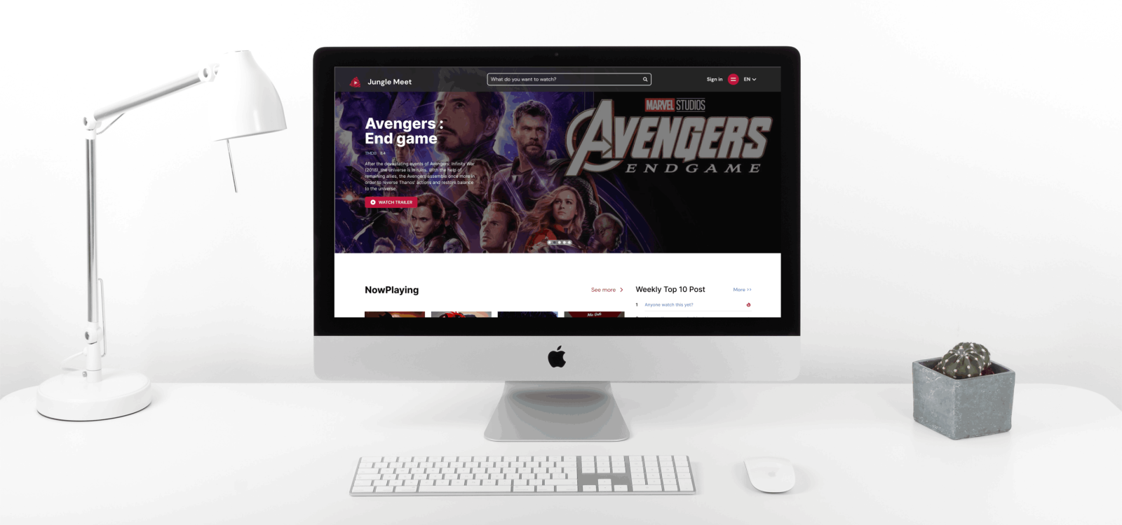
Jungle Meet
Website for people to make Movie discussion, where people come together to share their opinion
Overview
Jungle Meet is an innovative platform that serves as a community hub for movie enthusiasts. It is conceptualized as a digital jungle where diverse opinions, ideas, and discussions about movies thrive. The platform’s genesis lies in the recognition of the need for a dedicated space where film lovers can engage in meaningful conversations, beyond the limitations of general social media forums.
I acted as UI/UX designer and Full-stack Developer and teamed up with other 7 developers in four months and 4 DevOps deployed the website.
Details
Role & Responsibility
Design Research, UX/UI Design, Visual Design, Full-stack development
Tech & Tools
Adobe Photoshop, Figma, Miro, NextJs, Typescript, Redux, NodeJs, ExpressJs, MongoDB, Postman, Github, AWS
Duration
Sep 2022 – Dec 2022
Challenge
The challenge that Jungle Meet addresses is the lack of a specialized forum for in-depth movie discussions. Most existing platforms either cater to a broad range of topics or lack the features necessary for a focused and enriching movie discussion experience. This gap in the digital space results in fragmented conversations and missed opportunities for community building among movie fans.
Research
Interview Findings
We conducted 30-minute, one-on-one interviews with 5 participants who ranged from casual movie viewers to hardcore cinephiles.
Key Findings:
- Content Depth: A common thread among respondents was the desire for in-depth content. Participants like Alex expressed frustration with the lack of meaningful discussion on other platforms.
- Community Interaction: Users indicated a strong desire to build connections with others who shared their passion for movies. They wanted more than just discussions; they sought a sense of belonging.
- Usability: Many users reported being overwhelmed by cluttered interfaces on other sites. They expressed a preference for a clean, intuitive design that made navigation and participation in discussions easy.
- Exclusive Content: There was a notable interest in exclusive content, such as behind-the-scenes information, director’s cuts, and expert commentary.
- Recommendation Engine: Users voiced a need for a robust recommendation system that would suggest movies and discussions based on their past activity and interests.
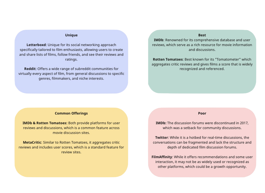
Competitive Analysis
We evaluated 5 leading platforms that host movie discussions, ranging from large social networks to niche forums.
Opportunities:
Expert Involvement: Differentiate by featuring discussions led by film experts, offering users access to professional insights and deep dives into cinematic topics.
Integrated Viewing Options: Simplify the user journey by linking directly to streaming services, providing a seamless transition from discussion to viewing.
Advanced Filtering: Enable users to fine-tune their content discovery process, ensuring they engage with discussions that align with their specific interests.
Offline Events: Foster a sense of community beyond the digital space through in-person meetups and virtual events, promoting real-world connections among users.
Persona
Based on research findings, I created a persona that represents the target user of the Society and their needs and habits. This helped me to empathize with the end-user on the remaining steps of the design process.

Ideation
Site Map
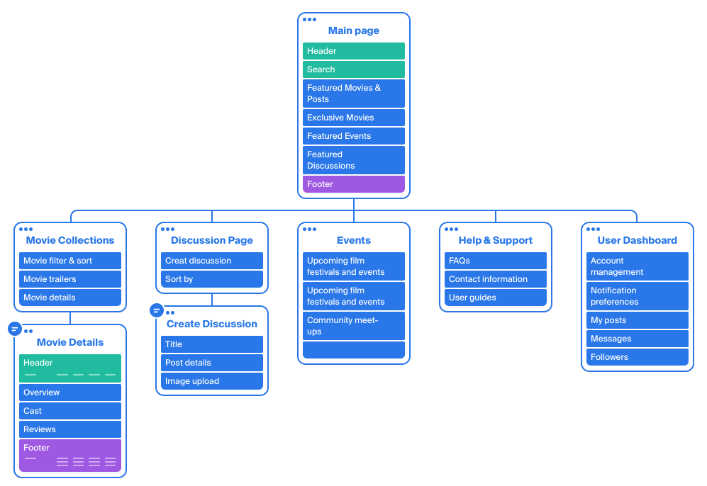
Drawing on the research and insights gleaned from our persona development, I’ve meticulously crafted and structured the essential content and features for the website. Previously, the site was cluttered with outdated and superfluous information that lacked value. In revitalizing the site, I focused on distilling the content to only the most crucial elements, resulting in a streamlined and user-friendly experience.
During this overhaul, I managed to significantly condense the site’s content, cutting down the page count from 30 to a more manageable 8, ensuring that each page serves a distinct purpose without any redundancy. Similarly, the main navigation has been simplified from 7 to just 3 links, making the site more intuitive and easier to explore.
User & Task Flow
I created the user task flow for creating discussions and the event registration process, which are the most important site’s functionality. Task flow assumes a visit by a guest who’s not a member of the website yet.

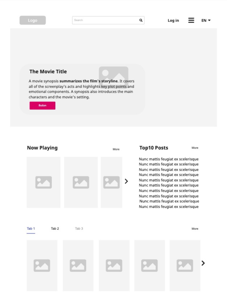
Lo-Fi Wireframes
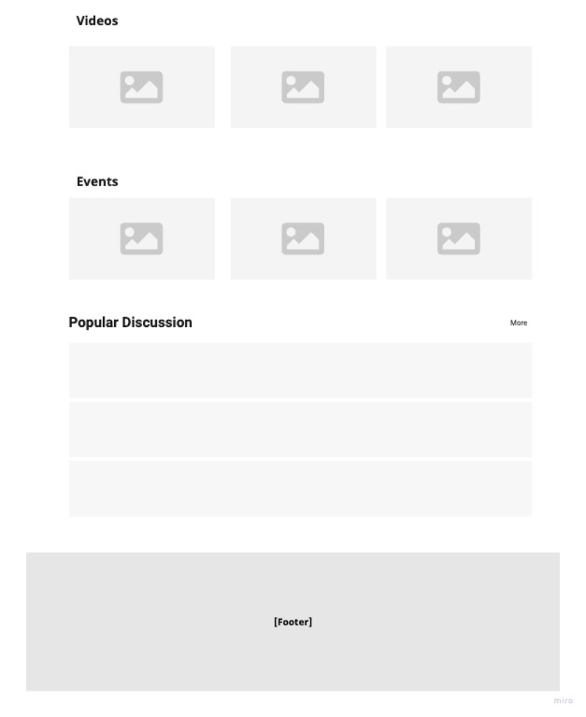
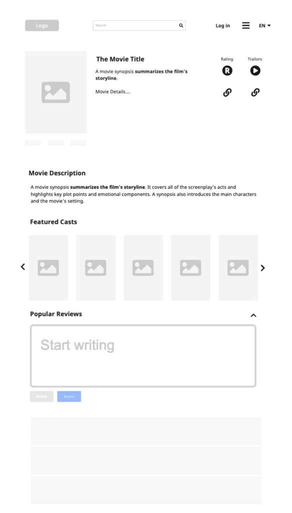
After defining the main user task and flow, I attempted to create the first set of lo-fi wireframes to run some preliminary testing with the actual users. That allowed me to gather some initial feedback and save time later in the process before I started the high-fidelity prototype.
Logo Design
The world is big like a jungle and meeting each other with the same interest in movies is even harder. Jungle Meet let our users talk to people with similar interest online and share their opinions.
Our vision is: “Have fun while sharing movies!”
Global style guidelines
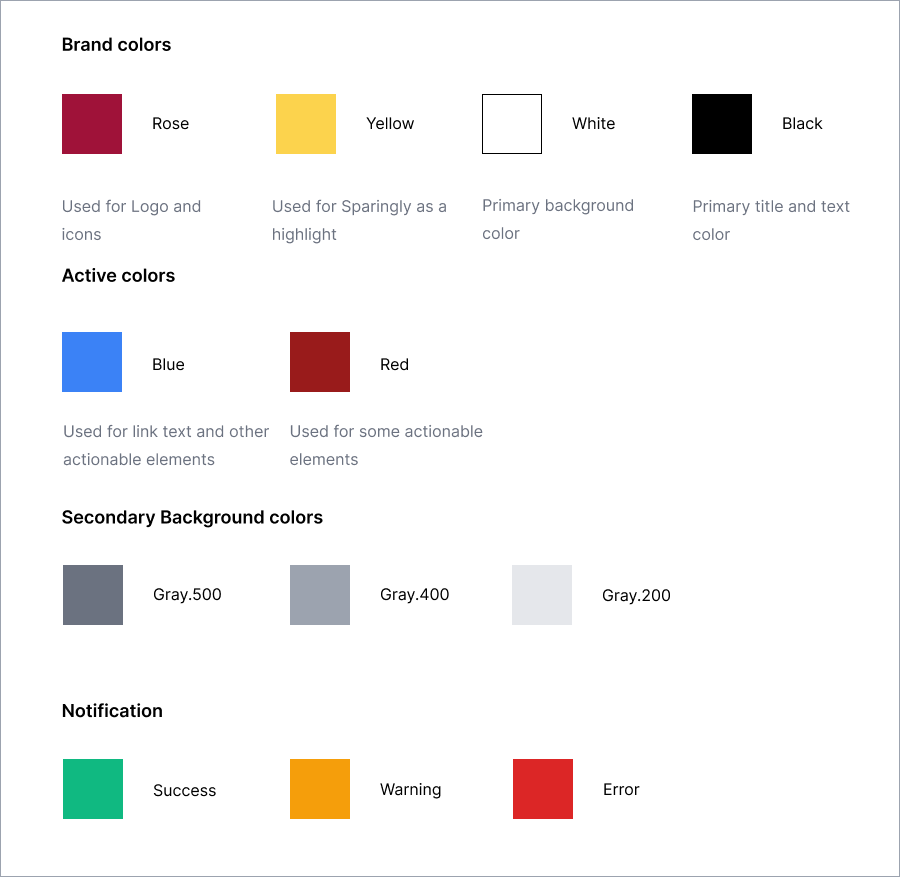
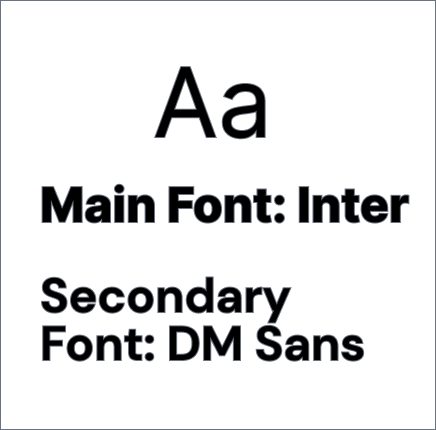
Before developing the first version of the UI, I created most of the styles in the UI kit with the logo. My goal was to keep the elements I was designing cohesive with the newly developed brand colour. I have selected a simple set of icons, typography, and a colour palette using different shades of the logo. I wanted the new site to represent the more approachable and relaxed version of the Jungle Meet.

Prototypes
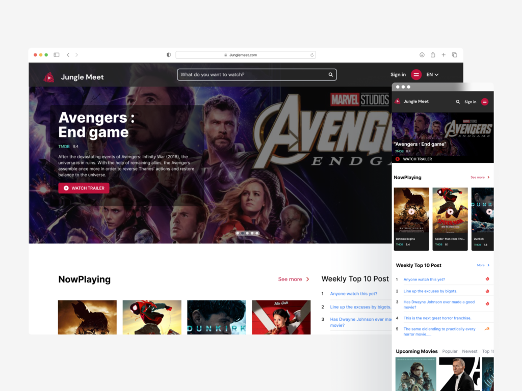
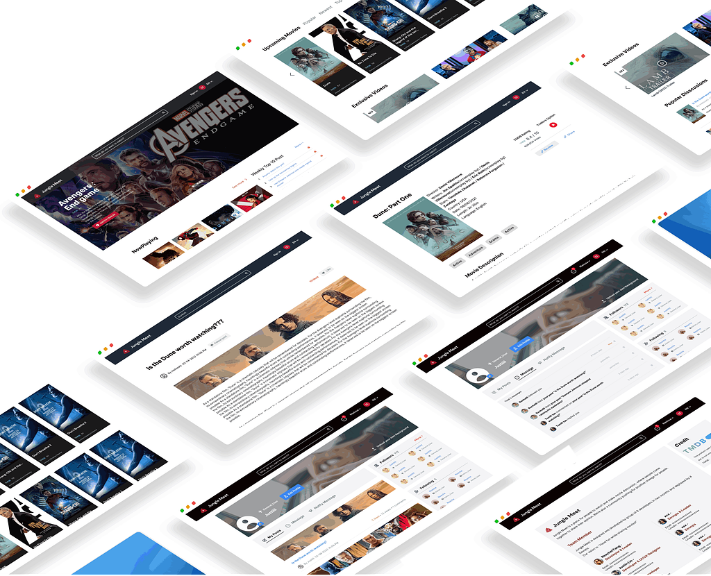
The prototype aims for a clean, sophisticated appearance, given that our target audience is willing to invest in premium experiences. We recognized the significance of incorporating captivating visuals throughout the site to enhance its appeal. With the target audience in mind, the interface was crafted to be both intuitive and visually engaging.
Reflection:
Balancing design and coding requires strategic planning and time management. Tackling both aspects simultaneously can be challenging, but establishing a clear plan and allocating sufficient time for each task ensures a smoother process.
Engage engineers early and frequently. Working closely with the engineering team from the outset proved to be invaluable for gaining insights into interaction design and streamlining design handoffs.
- Moving forward, our focus will shift to creating a mobile-responsive design and developing features tailored to mobile devices, as our initial efforts concentrated primarily on desktop size and functionalities.
