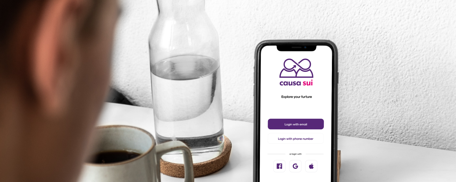
Causa Sui
Latin term that denotes something that is generated within itself
Overview
“Causa Sui” is a mobile application designed to make self-employment more inclusive and accessible for people with disabilities.
This was created as part of an online hackathon organised by Design-athon, with the objective being to come up with an idea to solve the challenge ‘Inclusive Future of Work’.
Details
07 – 30 September 2021
Role & Responsibility
UI/UX design, Prototyping & Testing, User Research, Interaction and Visual design
Tools & Technologies
Genial.ly, Final Cut Pro, Figma & Miro
Background
As part of the monthly hackathon, my team and I wanted to tackle this issue and how can we break down barriers to self-employment and empower people with disabilities who want to be self-employed.
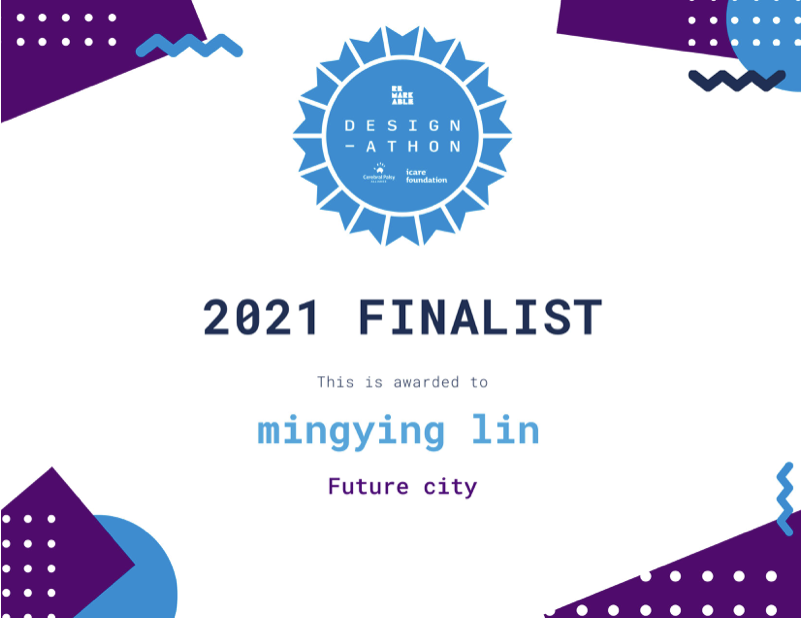
Causa Sui won the Finalist award in Design-athon.
I was the UI/UX designer on the team alongside another designer, 2 developers and 2 scientists. I was responsible for the product design and UX/UI experience for the app. Some key achievements are listed below:
Applied design sprints to inform our process. I was able to effectively apply the design sprints process to empathize, ideate on the solution, prototype and present the product.
- Won the Top 3 design award of the challenge topic ‘Inclusive Future of Work’. It’s worth noting that the best designs are not a result of the designer on the team. Each person from design, science and programming was able to contribute to the solution which resulted in a very collaborative and impressive result.
Understanding the challenge
How might we make self-employment radically more inclusive and accessible to people with disabilities?
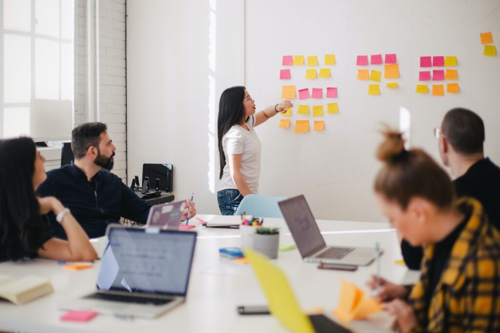
I researched online materials including some previous interviews and reports related to the challenge. We also conducted the brainstorming using the platform that was provided by Design-athon called ‘Sprintbase’ and interviewed participants to uncover pains felt by individuals with disabilities. It was revealed that:
- Importance of having a network of supportive peers or advisors, but difficulty in finding them
- Simple/existing tech can greatly enable disabled people’s capabilities in both employment and self-employment
- Disability giving rise to a personal mission and greater resilience
- Do not have enough inclusive programs, mentors, tailored networks and educational opportunities for people with disabilities to start their own businesses.
Product vision and ideas
As a starting point, we each did some market research on competitors to investigate the current offerings in the market and take inspiration from particular features that we liked about each app.
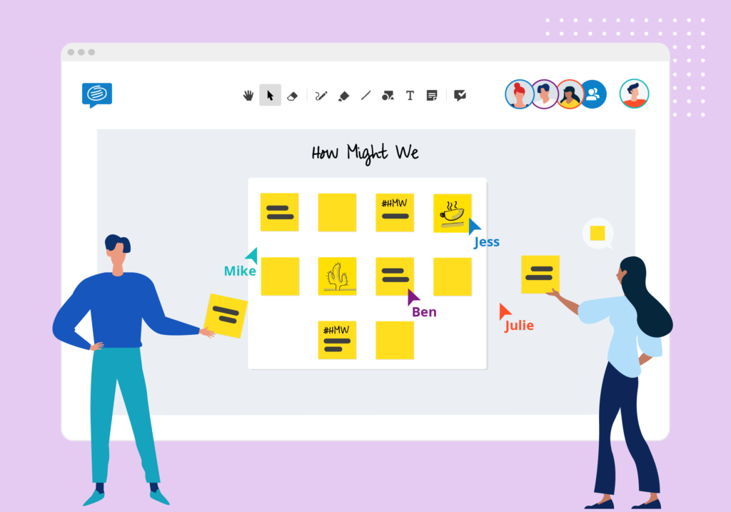
We then conducted a 30-minute ‘How might we’ or HMW method session to take the insights and pain points we hear and positively reframe them. It encourages each member of the team to write out their vision of the solution.
Defining the MVP
Based on the HMW method sessions, it was revealed that there were commonalities in the product vision. We identified the following key user stories:
- Show them the potential career. Users going through a vetting process to ensure they never match with the wrong potential career.
- Match with professional tutors. The system matches you with online tutors that have a large array of similar careers.
- Online resources and tools. Provides users with a suite of resources, tools, and recommendations that can empower users to make the best decisions on their pathway to self-employment!
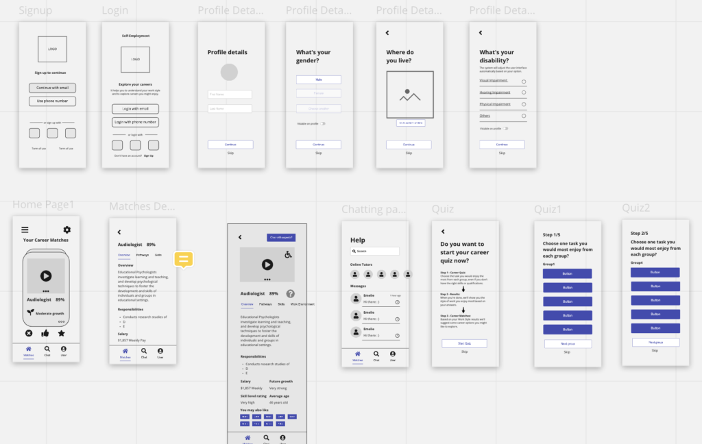
In order for us to see if there is anything that we need to improve, I mocked up the first version of the main screens for the MVP based on the idea and came up with the following:
- Login screen
- Register profile
- Career quiz
- Career matching
- Career details
- Online tutors
Design
I quickly did some mockups of the basic user journey before going over it with the desired styling. I then changed some wireframe designs based on the feedback from the tester and team members. After that, I created the first version of the prototype while another designer was working on the brand logo and improve the prototype base on testers and team members’ opinions.
Main Colour Scheme
We chose the main colour scheme using contrast tracker base on the research and referenced Remarkable’s Palette. I made sure the colour and background are high contrast which enables people with visual impairment to the app elements. It benefits all users in different light conditions.

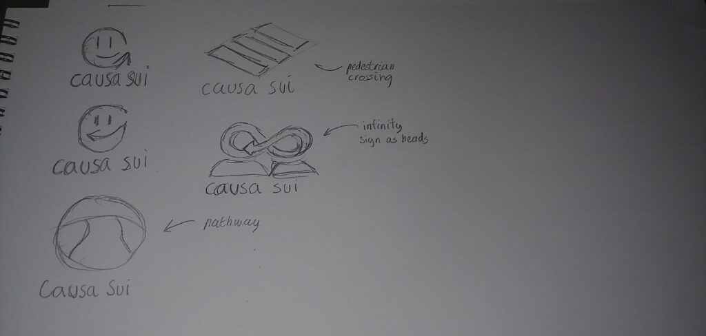
Logo Design
Landing Page
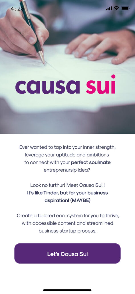
This screen was simply created to showcase our logo and encourage users to click on the button to get started.
Sign up Page
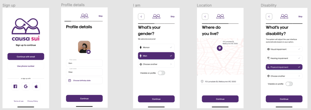
Users would fill in few steps to create a new account and the user interface will be changed based on their option.
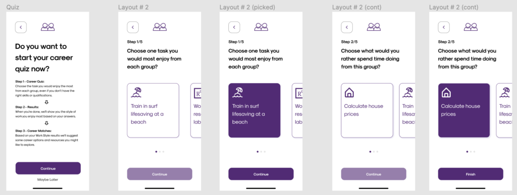
Career Quiz
Users going through a vetting interest process to ensure they never match with wrong career.
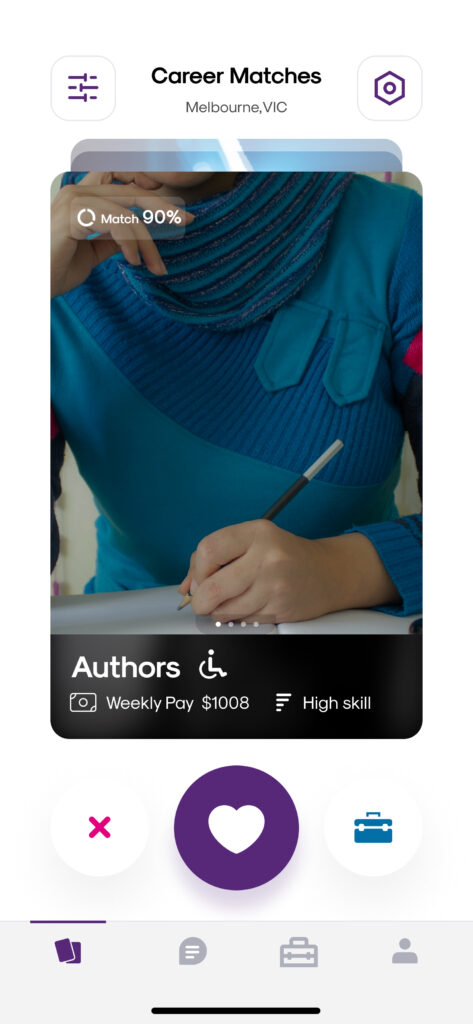
Main Page
Provide users with multiple career options and they can choose to read more or dislike it. Users going through a vetting interest process to ensure they never match with wrong career.
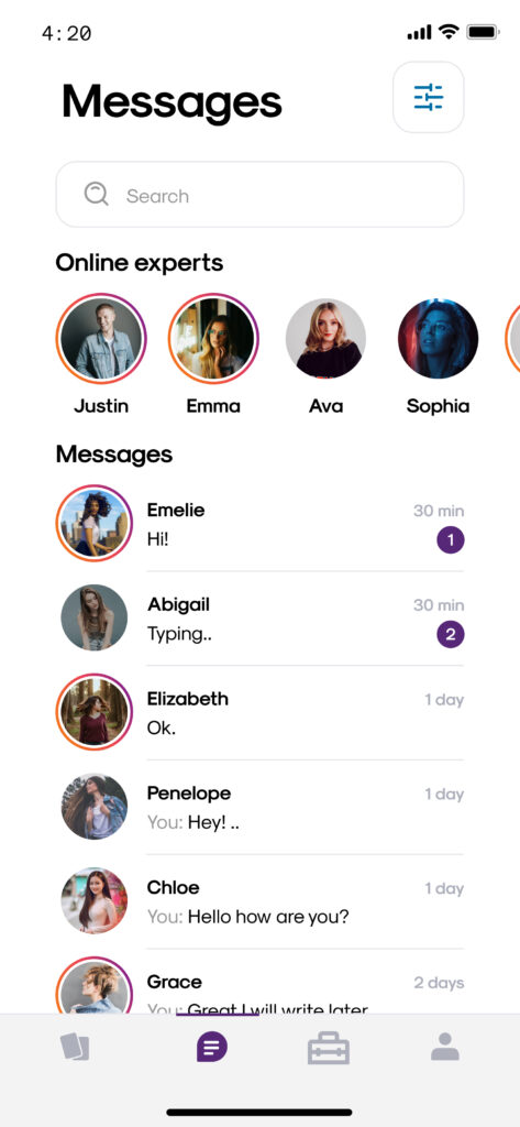
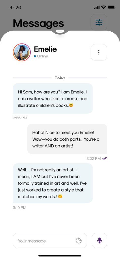
Online Professional Mentors
Users can choose to chat with online mentors that related to their favourite career and learn some self-employment advice from the experienced mentor. It will also provide a networking opportunity.
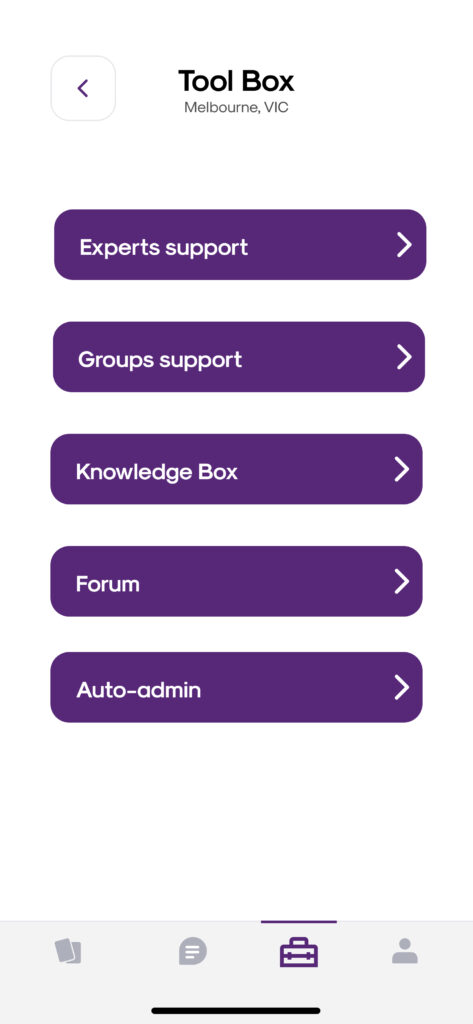
Tools Page
Helpful tools are available in the app to help people to start their self-employment careers.
Product Interaction
Final Presentation
Results and takeaways
We were able to successfully make the two and half minutes video and submitted a presentation at the end of the hackathon to a panel of judges. We took home the Finalist Award at the end of the week.
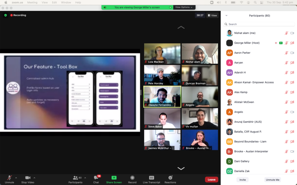
A big Thanks to Design-athon and all the tester, tutor and interviewee that helped our team to make the product better, I had a really enjoyable experience at this hackathon. I was extremely fortunate to have worked with some incredibly bright and talented team members to come up with an innovative product.
Some key takeaways from this hackathon are that:
- A good design tool is key. The lean framework really helped to shape the meetings and discussions with the team on Slack as it allowed me to stay focussed and on track throughout the entire hackathon.
- The inclusive design thinking approach is great. The reason we won lies mainly in us going out and interviewing the users, validating our idea, understanding their needs and designing based on that. User Experience is more than just whether the tech is easy to navigate.
- Think of everyone and design more inclusive products. Our goal as designers is to be advocates for improving the human experiences of everyone, not a measly few.
